
Before the 2007 IPCC report was released, this infographic was taken out (click for larger version):
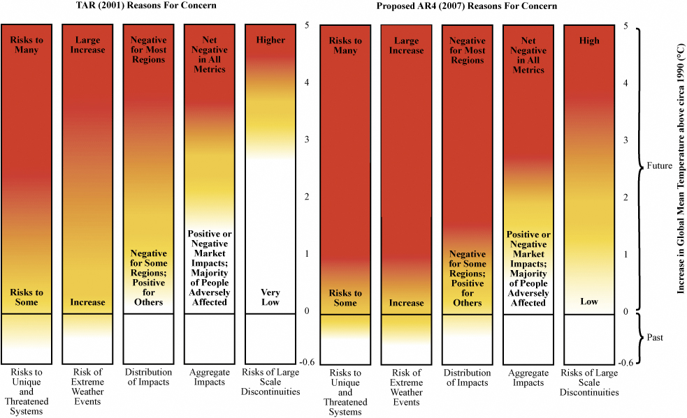 Seems the scientists were uncomfortable with it, deeming it too subjective, or too scary, or something. Basically the red shows the growth of various risks between 2001 and 2007. Surprise: risks have grown!
Secure · Tax deductible · Takes 45 Seconds
Secure · Tax deductible · Takes 45 Seconds
Andy Revkin has more.

