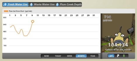
Building Dashboard
Perhaps you have heard of the big flush. It happens every morning, Harper’s reported a few years back:
The greatest increase occurs between eight and nine in the morning, when [New York City]’s output swells from 70 million to 150 million gallons per day. This is known as the big flush. Now it was eleven A.M., and in a few hours the circadian flow of biology en masse would begin to diminish, eventually bottoming out around four in the morning, at 68 million gallons per day. The rhythm is as steady as the tides. “The Super Bowl halftime surge is a myth,” said Askew.
Normally, all this happens in secret. But, in a bid to help educate citizens about the resources they use, the city of Oberlin, Ohio, is showing and telling, with a dashboard that shows outputs of infrastructure like the city’s freshwater treatment plant and power plant. And, yes, the big flush. PRI’s Living on Earth reports:
Clicking over to the water dashboard, the site presents information about water use, waste water processing and even the storage level of a local reservoir.
“If you look at that in the morning, you’re going to see high use because people are taking showers. There are times of day when our little bit of light industry within Oberlin is going to be using more water,” [project developer Jon] Petersen said.
It’s all pretty mesmerizing. Especially how the accompanying animated fish gets ever more pathetic the more water the city uses. It’s enough to have the city’s entire population of children — the tool’s been popular with kids — chastising their parents for their too-long morning showers and advocating a household-wide “if it’s yellow, let it mellow” policy. Then again, it’s Oberlin, so the kids were probably doing that already.


