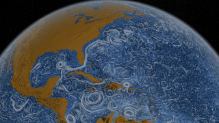
Last year, a group of NASA scientists and animators put together this animation of the world’s ocean surface currents, based on ocean flow data for June 2005 to December 2007. The video starts over the Atlantic, and as the globe rotates, you can see the whorls and waves dancing across the ocean, the relative calm of the Pacific, and the stillness around Antarctica. It’s dazzling and hypnotic. We really should be posting this on a Friday afternoon:
The tool NASA used to make the visualization — ECCO2 or Estimating the Circulation and Climate of the Ocean — actually has a greater purpose than providing entertainment for stoners. The tool “attempts to model the oceans and sea ice to increasingly accurate resolutions that begins to resolve ocean eddies and other narrow-current systems which transport heat and carbon in the oceans.” In other words, it’s the sort of model that can help scientists understand how carbon concentrations and climate change will affect the planet. It just happens to also look extremely cool.


