Last week, the White House released a beta version of a tool intended to govern the implementation of its much-publicized “Justice40” program. Justice40 promises that at least 40 percent of the benefits of government spending on infrastructure, clean energy, and other climate-related programs will be directed to disadvantaged communities. The Climate and Economic Justice Screening Tool, or CEJST, is meant to address the thorny question of which communities, exactly, are flagged as “disadvantaged.”
More than a year in the making, the tool considers 21 different climate, environmental, health, and economic indicators. To be considered disadvantaged, typically a community must be above the 65th percentile in terms of the proportion of its population that is low income, and it must also be in the 90th percentile or above in one of the environmental or health indices.
Conspicuously absent from the tool’s slate of indicators is race, despite its strong and well-documented correlation with environmental burdens. The Biden administration has come under fire from environmental justice advocates for excluding racial demographics, though officials say the tool is designed in such a way that it can still prioritize communities of color (and do so without becoming a target for legal challenges).
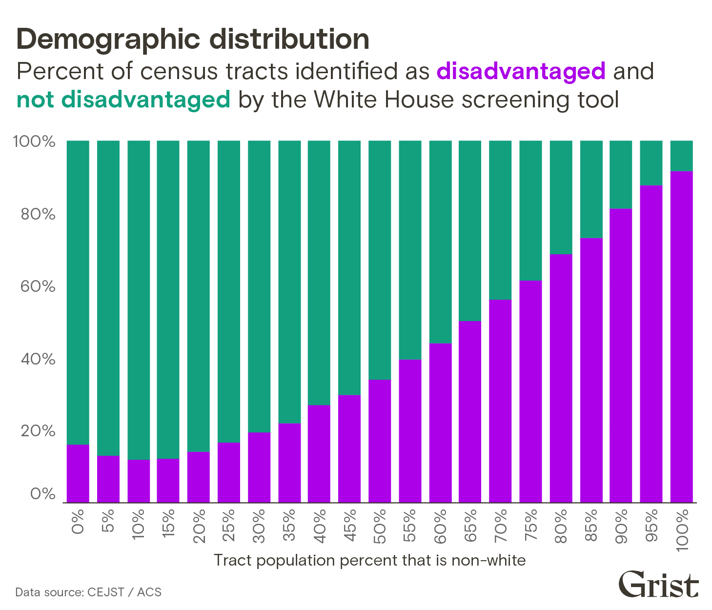
A Grist analysis suggests that there is strong evidence behind the administration’s reassurances: The tool appears to implicitly account for race in its selection of disadvantaged communities. A breakdown of all U.S. census tracts shows that, as the number of non-white residents in a tract increases, a tract becomes more likely to be considered disadvantaged by the White House tool. That’s because many of the criteria that the tool uses — proximity to hazardous facilities, linguistic isolation, and proximity to traffic, among others — are effectively functioning as proxies for race.

In other words, the tool confirms what environmental justice advocates have long argued: Race is one of the most potent predictors of pollution burdens. By prioritizing communities with the greatest pollution burdens, it has automatically prioritized communities of color as well.
“The tool they came up with is highly correlated with race,” said Manuel Pastor, the director of the Equity Research Institute at the University of Southern California. Pastor reviewed Grist’s findings and said the analysis illustrated “the unfortunate truth that there are significant environmental racial disparities in the United States.”
“Without question, race and racism are factors that have contributed to where pollution has been concentrated in this country,” a spokesperson for the White House Council on Environmental Quality said. “The environmental and socioeconomic data we are using in the tool helps show which communities are shouldering a disproportionate share of environmental burdens and climate risks.” The tool will be “continuously updated and refined based on feedback and research,” the spokesperson said.
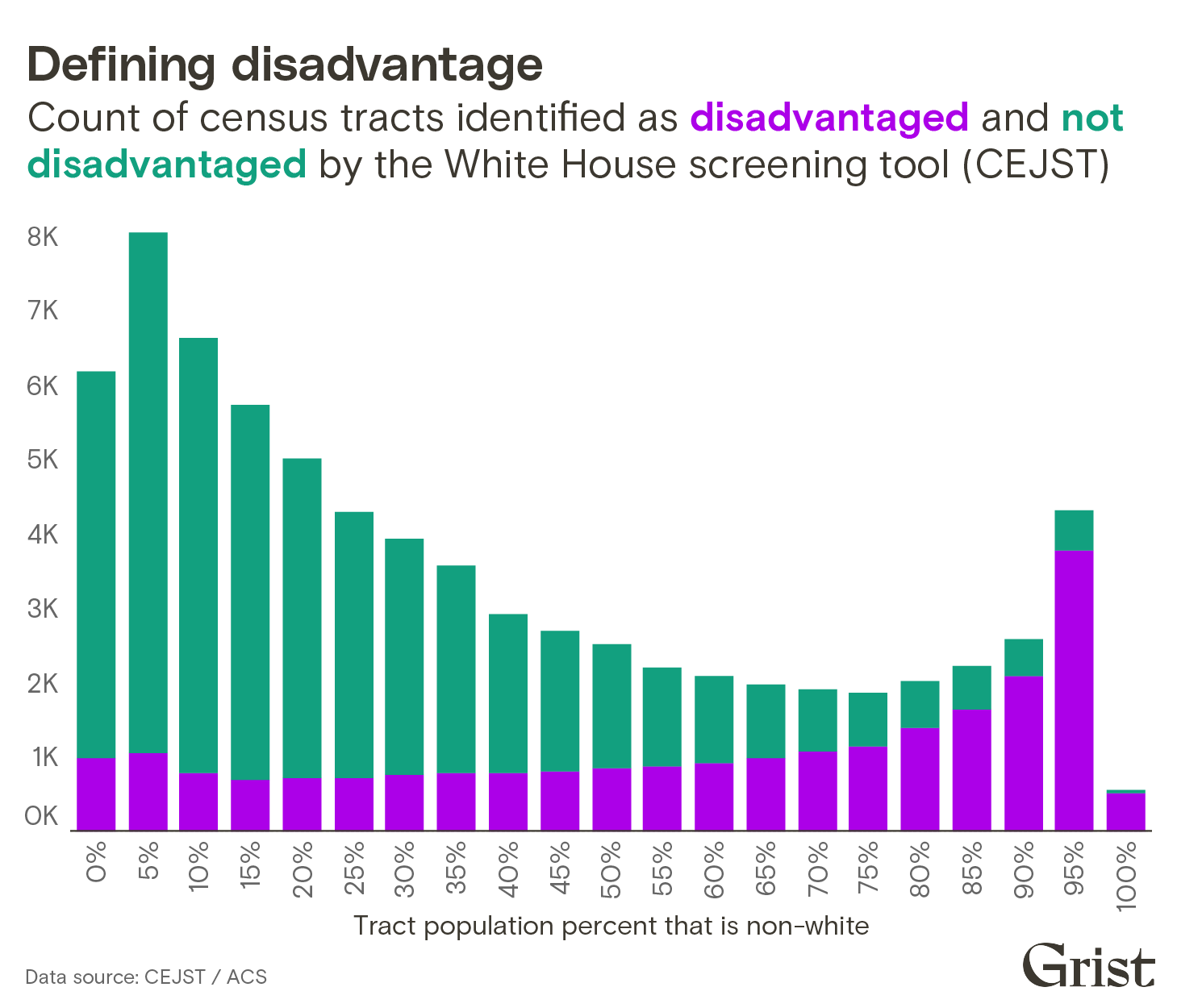
There are approximately 73,000 census tracts in the country, and the tool flags almost a third of them as disadvantaged. While tracts with a higher percentage of non-white residents are more likely to be flagged by the tool, the system also flags about 3,500 tracts where 20 percent or fewer residents identify as non-white. Likewise, the tool leaves out more than 2,200 tracts where 80 percent or more of the population identify as non-white.

The White House’s race-neutral approach is modeled after a similar approach taken by the state of California. Constrained by a ballot initiative that eliminated affirmative action in state funding, California developed an environmental justice screening tool that does not consider race or ethnicity outright. However, an analysis of the tool’s impact found that it ultimately did closely align with racial demographics and was effectively used to funnel money toward communities of color.
“Ideally, race should be a factor,” said Alvaro Sanchez, the vice president of policy at the Greenlining Institute, an environmental justice nonprofit based in Oakland, California. (Sanchez was a 2019 Grist Fixer.) Nevertheless, Sanchez said that California’s experience showed that “with the right methodology, you’re able to still identify those communities that are most in need, even if you’re not able to use race.”
There are significant differences between the White House’s new tool and California’s. For one, the White House tool does not consider the cumulative effects of various environmental, health, and socioeconomic burdens — how they might combine to create a greater burden than each indicator alone might suggest. Instead, the tool assesses eight categories in isolation. All eight categories use a combination of an income metric and other environmental, health, and climate metrics. If a community meets both the income and other threshold in any one of the eight categories, then it is considered disadvantaged.
For instance, the tool considers a tract low income if it’s above the 65th percentile in the income criteria. A tract is identified as having a high health burden if it is at or above the 90th percentile for asthma, diabetes, heart disease, or low life expectancy. Pastor described these thresholds as “arbitrary.”
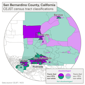
Such thresholds can lead to certain communities not making the cut despite being barely distinguishable from their disadvantaged neighbors. Take census tract 6603 near Bunker Hill in San Bernardino County, California. The tract is not considered disadvantaged by the new federal tool but is surrounded on all sides by tracts that are. About 6,000 people live within the tract’s boundaries, and 83 percent of the residents identify as people of color. The tract scores in the 96th percentile for minute particulate matter in the air and the 91st percentile for exposure to diesel particulate matter. It also has a number of hazardous facilities within 5 kilometers. But the tool does not flag it as disadvantaged because the community is in the 62nd percentile for the low income metric. The tool’s cutoff is 65th percentile and above.
A neighboring tract, which has a similar environmental burden, was flagged by the tool. It landed in the 68th percentile for low income, which pushed the tract across the cutoff line set by the tool.

Sanchez said that when California was developing its screening tool, it ran into a similar issue: Some census tracts were surrounded by disadvantaged tracts but weren’t being flagged as disadvantaged by the tool, despite suffering from similar issues on the ground. (After all, air pollution does not respect census tract boundaries.) The state addressed the issue by adding a rule that a percentage of the funding had to be used in low-income census tracts that are within a half-mile radius of a disadvantaged community.
Both Pastor and Sanchez emphasized the need for more community engagement as the White House moves to finalize the tool in the coming months. California held meetings to solicit feedback from residents, and community members were “part of a messy process of creating the methodology,” said Pastor. As a result, the tool had extensive buy-in when it was finalized. Once it was launched, the state agencies responsible for the tool also held webinars to walk people through the tool, did tours around California, and held a number of meetings.
Sanchez said California’s approach was “very different” from the White House’s process. “Unfortunately, the White House tool is a lot less inclusive and transparent, and it’s leaving a lot of question marks,” he said.
To promote transparency while it was designing the tool, the White House set up an online community that is open to anyone who wants to discuss various approaches to building the tool. A number of software developers, environmental justice advocates, scientists, and staff from federal agencies have joined regular calls and contributed code over the past year as the tool was being built. As the tool was taking shape, the code powering it was routinely published on GitHub, a public code-hosting platform.
The website for the tool also provides avenues for giving feedback, and a notice has been published in the Federal Register requesting public comment on the tool by April 25. A spokesperson for the White House said that reviewing feedback on the tool is “a key part of the process” and that they welcome feedback in the coming days. “The goal is to improve the accuracy of the tool in capturing the most overburdened and underserved communities in America,” they said.


