When I started out at Grist in 2013, I covered climate change activism — which was interesting, and still is. Whether you’re a fresh-faced youth from a maple syrup farm or a former hedge fund manager, trying to change the world for the better is a tricky business.
What was not interesting — what was negative interesting — was the photos. How do you represent divestment? At first, I tried to use photos from divestment-related events — which were pretty much always protests at college campuses.
But one campus protest looks pretty much like any other campus protest. And what to do about that guy — there’s always that guy — standing in middle of every shot, who’s a dead ringer for Ras Trent? College students have the earnestness, the lack of dependent minors, and the flexible schedules to really accommodate protest attendance — but they are far from representative of an entire movement.
And so I fell back on stock images. Divestment was about money — so how about a tiny person sailing across a money ocean? What about a tower of money reaching up into space? Not perfect, but it would have to do. But then how to illustrate oil-by-rail? What about a new solar panel regulation ruling? Or another story about melting glaciers? Have polar bears jumped the shark?
A recent study from Climate Outreach, a British climate change communication think tank, sets out to answer just this question: What images do the best job of making climate change — which consists of difficult-to-photograph, or empathize with, changes to the troposphere — seem like a real thing that people might want to pay attention to?
To explore this question, Climate Outreach held four in-depth focus groups (two in London and two in Berlin) followed by a less in-depth online survey of 3,014 people, with participants split equally between the U.K., Germany, and the U.S. Climate Outreach showed them many, many photographs. The result: a report on what does and doesn’t work for illustrating climate change, and a collection of images they consider to be ideal. Here’s what the group found:
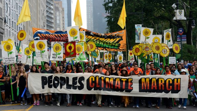
No one likes pictures of protests (except for protesters)
Images of protesters had some of the lowest ratings in the survey (with some exception for the small number of study participants who considered themselves activists). “Most people do not feel an affinity with climate change protesters, so images of protests may reinforce the idea that climate change is for ‘them’ rather than ‘us,’” the Climate Outreach findings summary said. “Protest images involving people directly affected by climate impacts were seen as more authentic and therefore more compelling.”
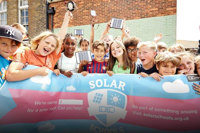
However: Not many people like posed photographs of happy children with solar panels, either
Photos with people were rated more highly than those without, especially if those people were looking directly into the camera. But of those images, spontaneous-looking photos received much higher ratings than posed ones.
For example, the photo above, of adorable children holding a banner and waving solar panels in the air, got points for being cheerful, but was viewed as “gimmicky” and “staged.” Same with a photo of several people watching enthusiastically while someone installed weather-stripping on a door. “I think that family needs to get out a little more,” a focus group member said. An unposed photo of a man installing insulation all by himself was viewed with much more enthusiasm.
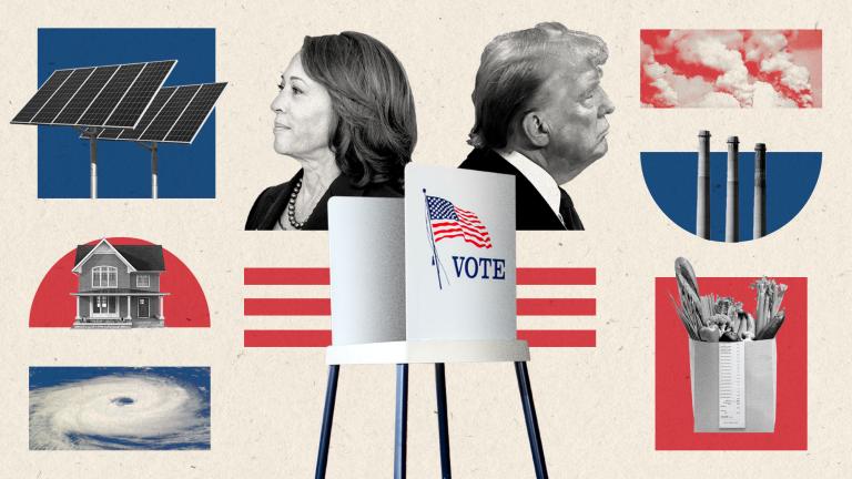
Posed pictures of politicians were the lowest-ranked photos of all. The two lowest-ranked photos in the survey were images of President Barack Obama making a speech (shown to survey responders in America) and Prime Minister David Cameron posing with a sled dog (shown to survey responders in the U.K.). An unposed photograph of Chancellor Angela Merkel looking thoughtfully at a green energy installation was slightly more favourably rated. The Climate Outreach study concludes:
Many campaigns and articles focus on climate policies, and so it is unrealistic to expect that photos should avoid politicians altogether. However if an image is designed to send a positive signal the politician should be as authentic and credible as possible — doing something useful rather than posing for a photo-opportunity — and the widespread distrust of mainstream politicians should not be underestimated. As one German discussion group participant put it, all the images of politicians “make me almost vomit.”
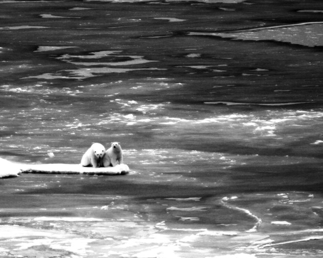
Nothing says “this is an article about climate change” like a polar bear. Nothing makes people feel cynical like a polar bear.
Classic climate change images like polar bears on melting ice both got high ratings for being easy to recognize, and low ratings from people who were tired of seeing them.
One participant (in a comment characteristic of the London and Berlin groups) said “… the polar bear … makes me angry for some reason. Not because I’m like ‘oh no that’s a pressing issue’, but like ‘oh this is so annoying’ I don’t want to see them again.”
The few participants who were worried about the polar bear were pretty much only worried about the polar bear. “I might donate for the polar bear thingy,” one participant said, “but not for global warming.”
People preferred photos of climate change effects to climate change causes
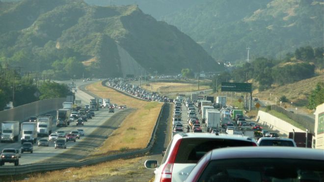
A photo of a traffic jam, for example, made more sense to those surveyed than a photo of an individual car — partly because traffic jams are something that everyone hates, while many people are fond of individual cars. As one German participant put it: “[This] is not climate change because that’s normal to drive a car. We can’t stop that. It’s normal.”
There are, of course, major caveats that come with this type of research. This is a very small number of people, from a very small number of countries. It’s hard to tell if an effort was made to adjust for age, income level, cultural background, or any number of things that a more comprehensive study would take into account. I also won’t be likely to use their database of climate images — for one thing, you can’t easily determine what’s copyrighted and what’s not. For another thing, while these images may have tested well, they all look like outtakes from a UNICEF brochure.
But still. I am someone who spends a lot of time looking at pictures of traffic jams, polar bears, and wind turbines. Many of the study’s findings resonated with me. All genres of journalism have their own special way of falling into a rut, and climate journalism is no exception. I have had those long, dark teatimes of the soul, cruising through image after image of people pointing at solar panels.
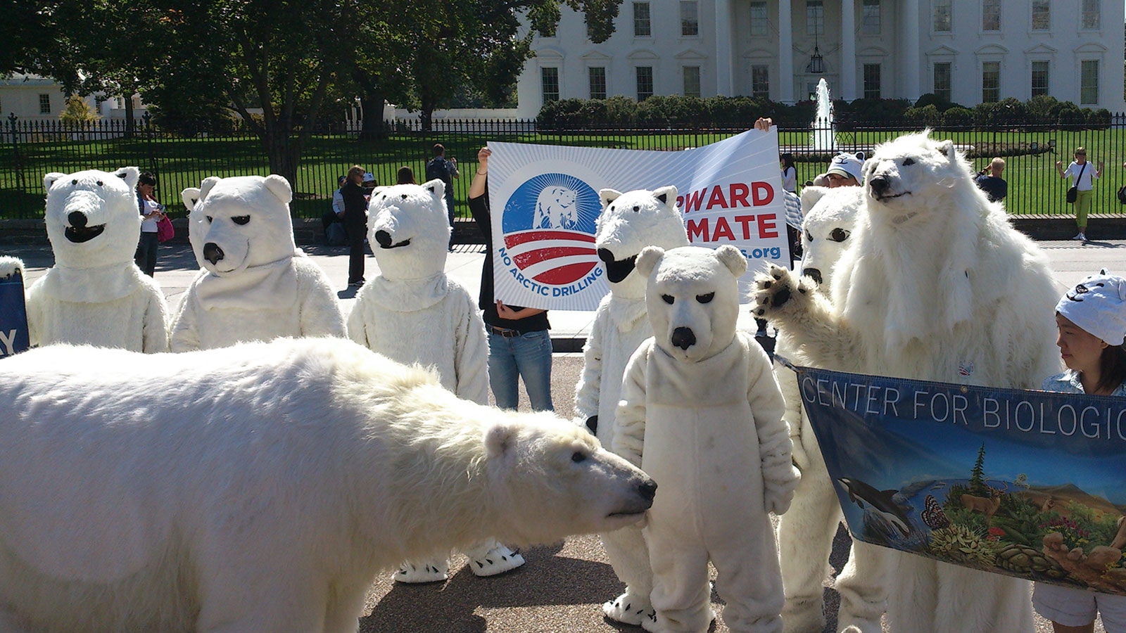
Maybe the answer is not to develop new image rules, but to try to break out of the old ones. So what if people don’t like pictures of polar bears? So what if people don’t like pictures of protests? I just found a picture of polar bears protesting. They are standing in front of the White House, no less. I’m pretty sure one of them is taxidermied. I think I saw another one get arrested in New York a few years ago. All of these furballs are totally disobeying market research — and they totally made my day.
