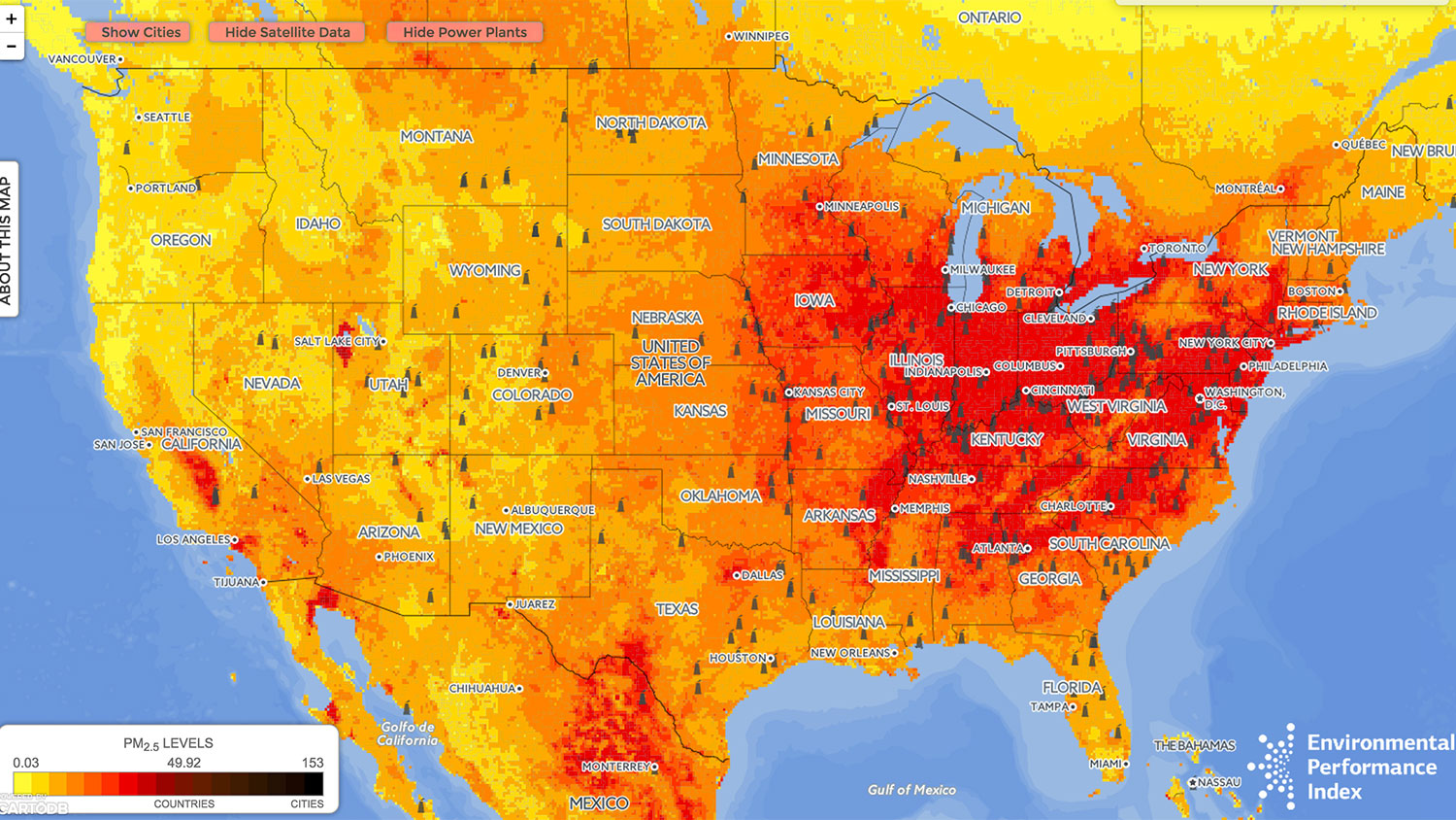
President Obama’s Clean Power Plan, released this week, is arguably the most ambitious effort ever untaken by the U.S. to fight climate change. But it will also create enormous public health benefits by cleaning up the air people breathe, saving thousands of lives annually in the U.S. Air pollution in some U.S. cities has in fact gotten worse over the past decade.
Our map, below, shows air pollution problem spots not just in the U.S. but around the world. It color-codes high-resolution air pollution data (specifically, fine particulate matter or PM2.5) from ground level (data reported by the World Health Organization) and from the atmosphere (satellite-derived estimates calculated by researchers at Dalhousie University). Regions shaded in black are exposed to very unhealthy or hazardous levels of particulate matter, and dark red to red represents unhealthy amounts, using classifications from the EPA’s Air Quality Index thresholds. The areas with safe air quality are colored yellow to orange. We also include locations of the world’s dirtiest power plants, according to Carbon Monitoring for Action (CARMA).
http://visuals.datadriven.yale.edu/airmap/
The map illustrates some clear trends:
- Poor air quality tracks urban population density. In China, much of the eastern and northeastern regions, where the most people live, are shaded dark red or black. In the U.S., much of the worst air is found in the Midwest and East Coast, where population density is highest, and there’s especially poor air quality in urban areas, where studies have shown that poor and minority groups are disproportionately affected. Northern Africa, which is less densely populated, is an exception to this trend; it has high levels of particulates in the form of Saharan mineral dust.
- The world’s dirtiest power plants are in areas with the worst air quality. We mapped the world’s “dirtiest” power plants (i.e., those that generate the most carbon), according to CARMA. It is perhaps unsurprising that China has the highest number of these dirty plants (a total of 610), followed by the U.S. (371) and India (187). If we consider countries with the highest density of dirty power plants (i.e., number of dirty plants per land area), small countries like Malta and Singapore are among the top 10, along with Germany and Poland. But what is also striking is that some countries, like Bangladesh and others in Southeast Asia, lack “dirty” power plants but are still exposed to high levels of air pollution.
- All countries experience some level of unhealthy air. Unlike other urban environmental issues that closely track economic development, such as access to clean drinking water and sanitation, air quality affects countries both rich and poor. Poor air quality is responsible for up to 1 in 12 deaths in some parts of London and shortens the average Briton’s life span by six months.
The Clean Power Plan has brought out a powerful set of opponents. If it’s to survive, it will need public support. Knowing where air is most polluted and why is a first step toward tackling poor local air quality and global climate change. Our map makes air pollution’s worst hotspots public knowledge, showing in high-res clarity the nation’s dirtiest air and the power plants that are the main culprits.
Angel Hsu, PhD, is an assistant professor of environmental studies at Yale-NUS College and the Yale School of Forestry and Environmental Studies. Alisa Zomer is a research fellow and manager of the Yale Environmental Performance Index. The map was built by David Wong, a computer science major at Yale College, from a map our group originally featured in The Atlantic in June 2014.


