When you think of American oil imports, you probably think of an empty expanse of desert with a few towering oil derricks sprinkled around. Heat shimmering off the sand. Trucks haul the fuel to tankers, which make their way from the Persian Gulf to some port on the Gulf of Mexico.
That image is wrong. What you should be picturing is a Mountie guarding a well ringed with maple trees.
Here, according to the U.S. Energy Information Administration, is where the U.S. imported oil from in October 2012, the last month for which data is available.
[protected-iframe id=”4ec9958f7e9df09603cec7ec789e95fd-5104299-34907067″ info=”//ajax.googleapis.com/ajax/static/modules/gviz/1.0/chart.js” width=”470″ height=”350″]
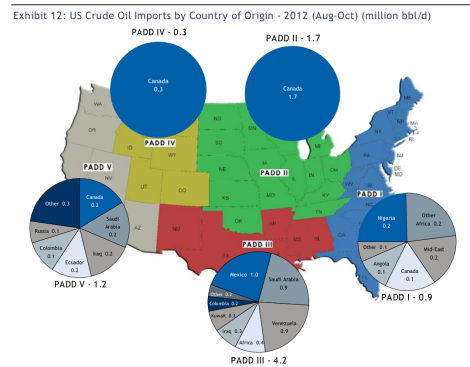
What’s most interesting, though, is how the source of oil differs depending on the region of the country you live in. Last week, Business Insider shared this map created by RBC Capital Market.

Business InsiderClick to embiggen.
While oil moves between regions, it’s fascinating to consider that the Midwest and Mountain West import only oil from Canada. The South’s main source, unsurprisingly, is Mexico, which provides us with almost as much oil as Saudi Arabia. And on the East Coast, more than half of our imported oil comes from Africa.
Assuming the data is accurate, this map gives the lie to the idea that our oil imports leave us at the mercy of states hostile to our interests. It also reveals that Mitt Romney’s proposal for North American energy independence was even easier to achieve than we may have realized.


