 Just wanted to point out a great website, "
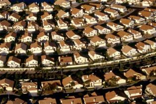 Just wanted to point out a great website, “Visualizing Density,” a product of the Lincoln Institute of Land Policy (LILP). I’m not feeling like my usual prolix self today, so I’ll let them do the talking:
Sprawl is bad. Density is good. Americans need to stop spreading out and live closer together. Well … that’s the theory, anyway. But, as anyone who has tried to build compact development recently will tell you, if there’s one thing Americans hate more than sprawl, it’s density … One reason people reject density is that they don’t know much about it — what it looks like, how to build it, or whether it’s something they can call home. We have very rational ways of measuring density, but our perception of it is anything but rational.
Secure · Tax deductible · Takes 45 SecondsSecure · Tax deductible · Takes 45 Seconds
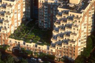 So to inject better thinking — and better perception — into the density discussion, LILP has created a truly awesome* collection of images of all types of densities, in many U.S. regions and climates. Check out the gallery.
I do have one criticism, however. There’s virtually nothing from my home turf, the Pacific Northwest. What gives, LILP?
All images in this post are copyrighted and used with permission. (Copyright: Alex S. MacLean, Landslides, Lincoln Institute of Land Policy.)
*I don’t use the word “awesome” lightly.
A message from
Your support keeps our climate news free. All donations DOUBLED!
Grist is the only award-winning newsroom focused on exploring equitable solutions to climate change. It’s vital reporting made entirely possible by loyal readers like you.
At Grist, we don’t believe in paywalls. Instead, we rely on our readers to pitch in what they can so that we can continue bringing you our solution-based climate news. Donate today to keep our site free. All donations DOUBLED for a limited time.


