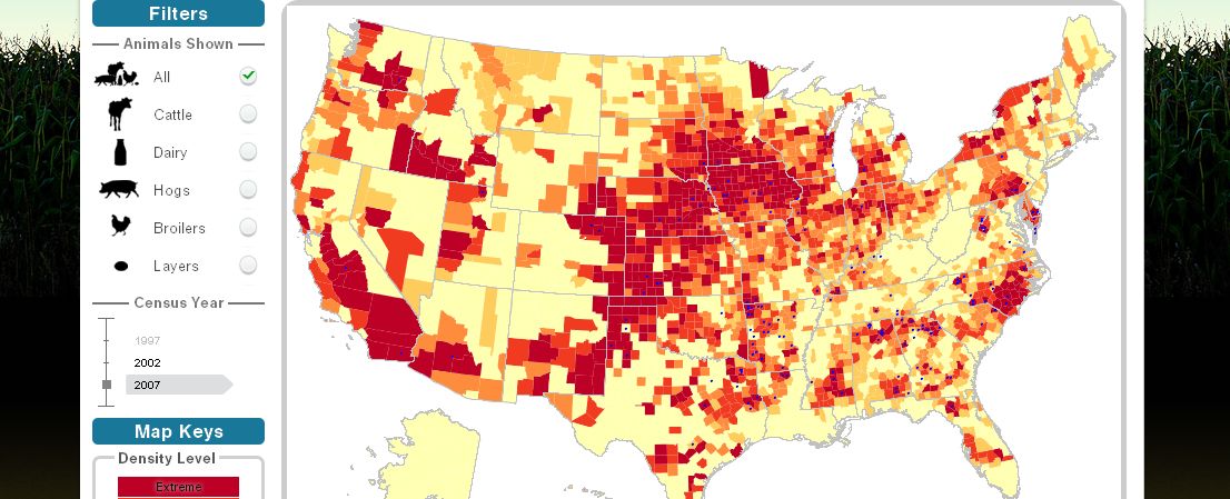
 Animal harm: The U.S. meat, dairy, and egg supply, in a map. The redder the area, the more “extreme” the conencentration of animals.Screenshots: Food & Water Watch
I’m always writing about the stunning concentration of the U.S. livestock industry — the way just a handful of companies (see here and here) produce the great bulk of the meat, dairy, and eggs consumed by Americans.
But our nation’s animal factories are also geographically concentrated. The companies tend to alight upon certain regions, buy and shut down all the competing processing plants, and set up massive, essentially monopolistic processing facilities. Surrounding farmers either scale up to meat the needs of the giants, or exit the business.
Food & Water Watch has created an impressive new tool, called Factory Farm Map, to study and document this trend. It’s an interactive map that draws from many disparate data sources to present the big picture of how Big Food concentrates animal production — and also lets users drill down to the county level. And it lets you do all of it by animal type — dairy cows, beef cows, meat chickens, laying hens, and hogs. Everyone interested in where the meat, dairy, and eggs sold by their supermarkets come from should play around with it.
Take eggs, made notorious this fall by the massive salmonella recall. The tool informs us that some 266 million laying hens are kept in factory cages to supply our breakfast tables. Where are they kept? Turns out, a few counties in California, a few others in Iowa, and a smattering across the East Coast. And that’s it — for 266 million birds. (Note: the darker the shade of red, the more “extreme” the concentration.)
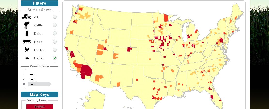 The highly concentrated nature of U.S. egg production.
I also had fun — in a very sick sense — honing in on a few counties with which I am familiar. As you see in the map below, eastern North Carolina is largely a sacrifice zone for industrial animal production, particularly hogs but also poultry. Smithfield’s massive Tar Heel plant, the globe’s largest hog slaughterhouse, operates there. (The celebrated 2007 Rolling Stone article “Boss Hog,” sadly no longer online, documented the immense environmental damage that intense hog production has wrought on eastern North Carolina.)
Duplin County, N.C, is highlighted magenta in the map below. Duplin, one of the most intense centers of production, has 53,000 residents, the Census tells us. Yet it has 2.2 million hogs, crammed together at the rate of nearly 6,000 per building. That’s more than 40 hogs for every resident. Now, we see from the chart that the county’s hog population has held pretty steady above 2 million since 1997 (after having grown explosively in the 1990s). But now I know that poultry chickens (broilers) are currently in a period of explosive growth there — a more than fourfold jump between 1997 and 2007.
Would you want to live in Duplin County?
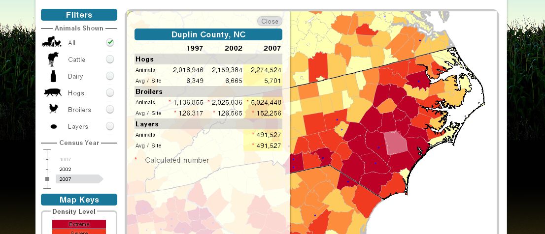 Duplin County, N.C. — 40 hogs for every person, and millions of chickens, too!
Here’s Wilkes County, one county east of where I live — and home to a massive Tyson poultry-packing plant. The county also houses 12.5 million chickens — with each facility crammed with 152,000 birds.
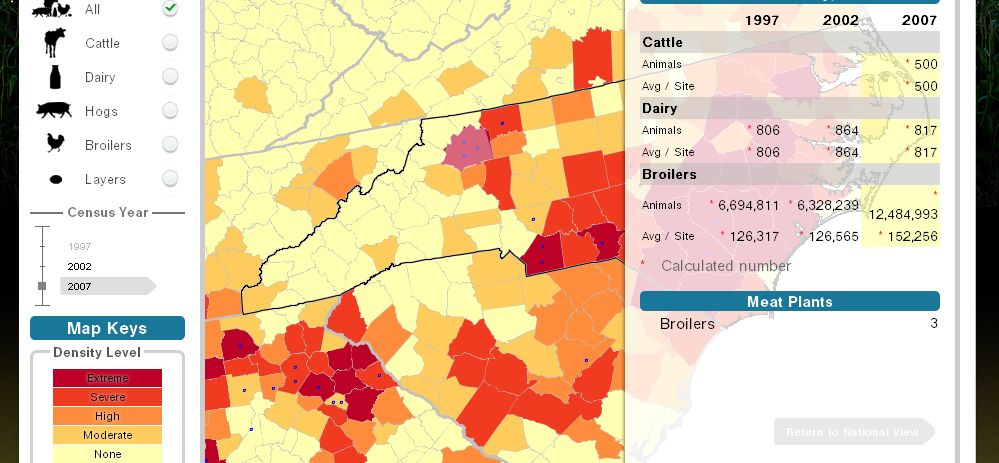 Just a county away from me, 12.5 million chickens squawk miserably in cages.
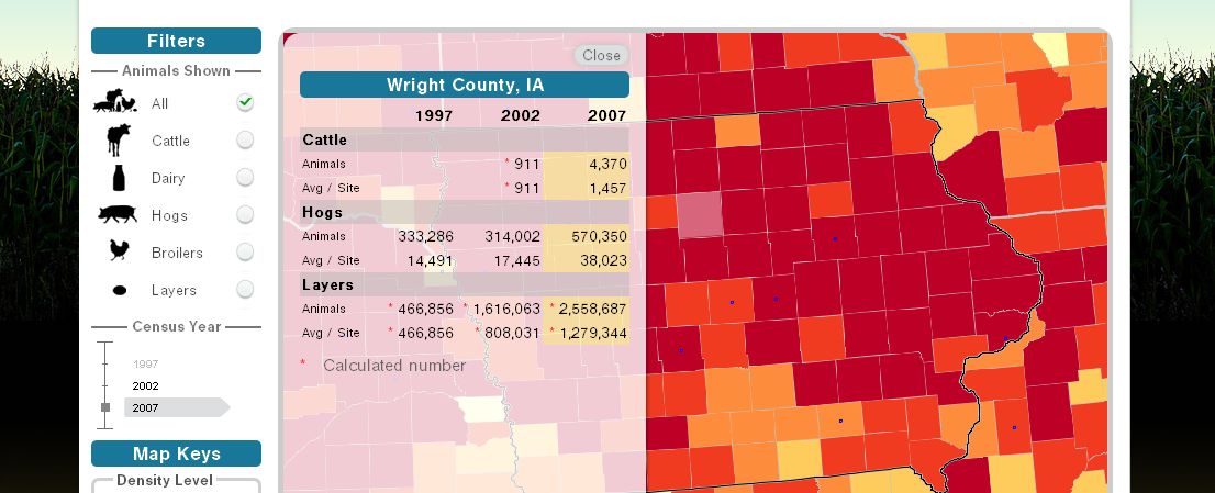
Then there’s Wright County, Iowa — where “habitual violator” Jack DeCoster moved the flagship of his egg empire after being chased out of Maine. Wright County, of course, is where DeCoster hatched his half-billion-egg salmonella disaster. Just yesterday, the FDA allowed Wright County Egg to start selling eggs from some of its facilities to the public again.
With the Food & Water Watch tool, we can see that since DeCoster alighted in Wright County, its laying-hen population soared by a factor of five. It now houses a stunning 2.5 million birds, divided between just two massive sites.
 They call it Wright County, but 2.5 million laying hens just seems wrong.
The meat industry operates under a cloak of darkness. With the data asembled here — drawn from a web of state and national sources — Food & Water Watch has given us a powerful flashlight for negating some of that darkness.

